Put On Your Best Show
Vimto has been around since 1908 and the message behind their brand has always been the same. With a focus on vim and vigour, Vimto is a refreshing mix of different fruits that make an invigorating and energising drink.
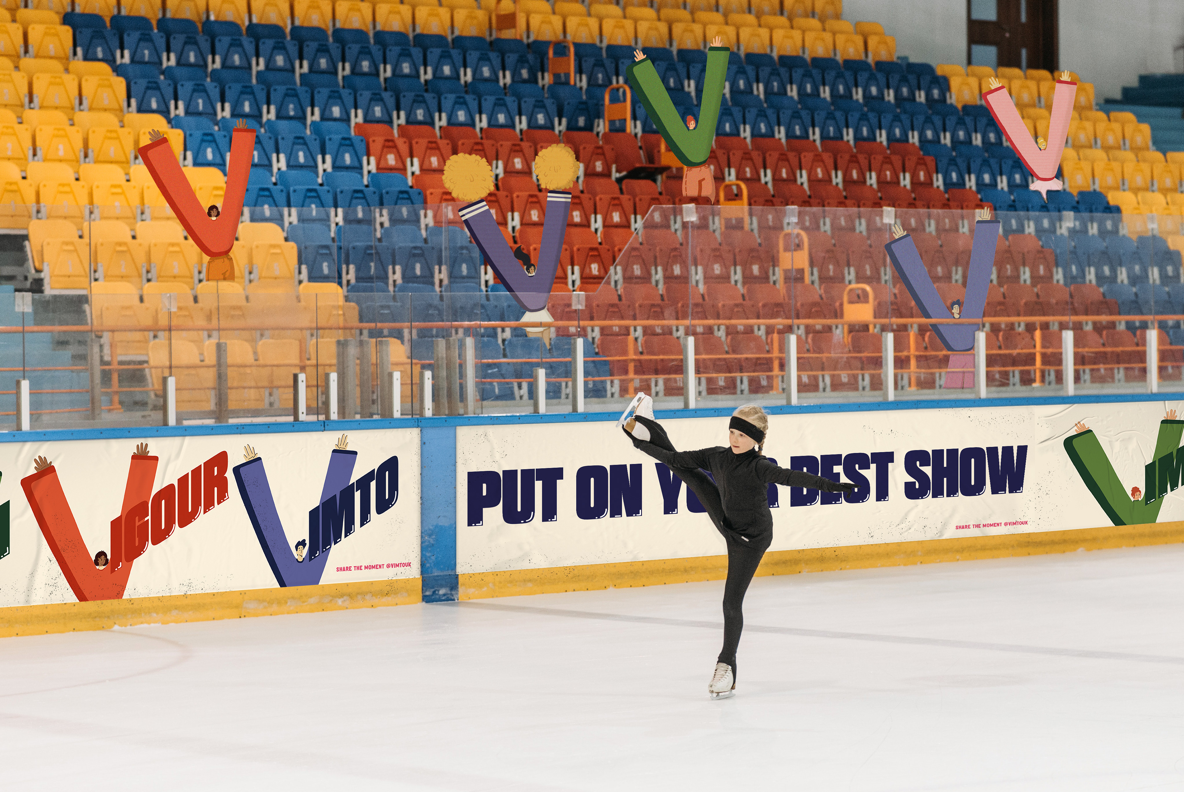
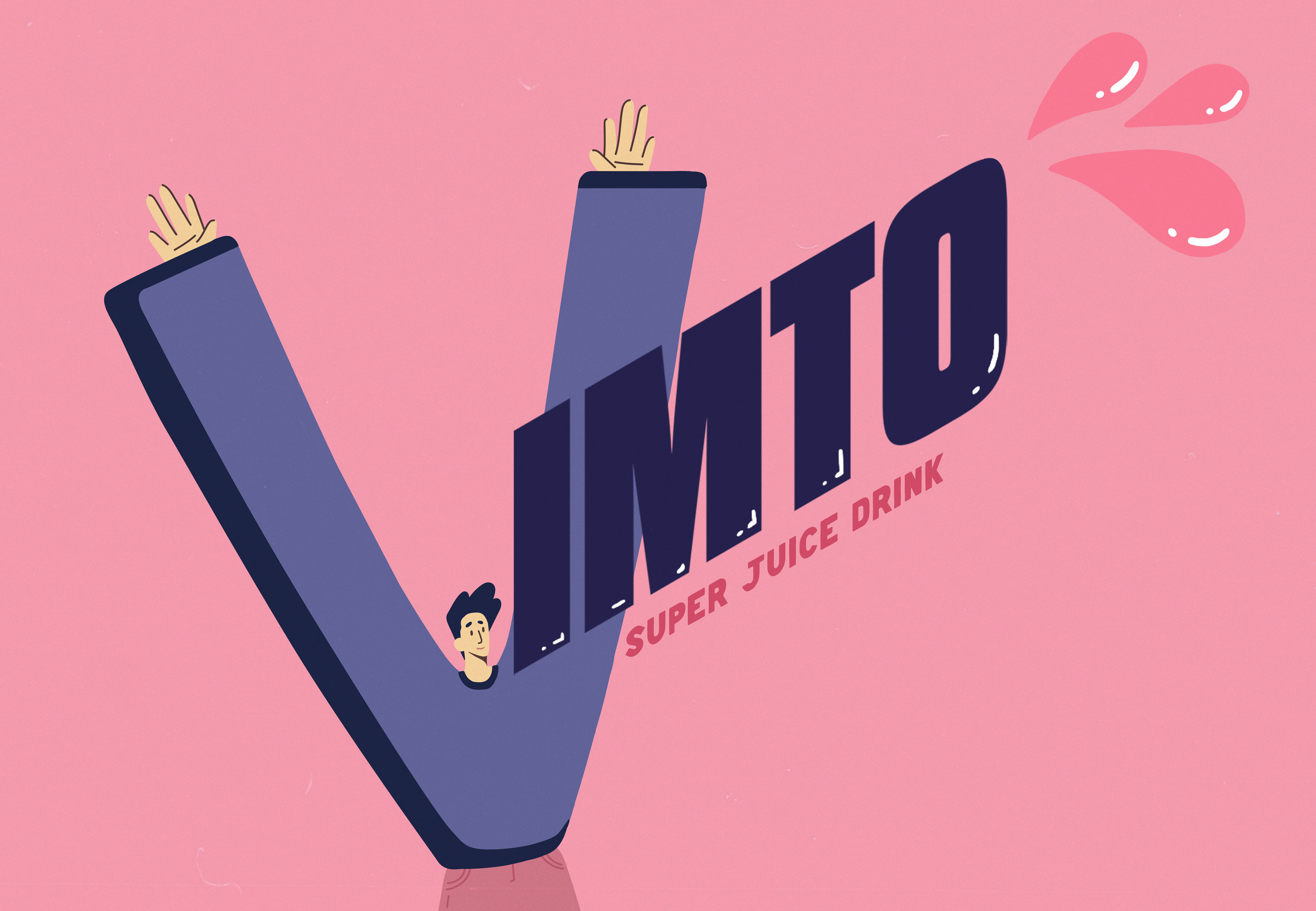
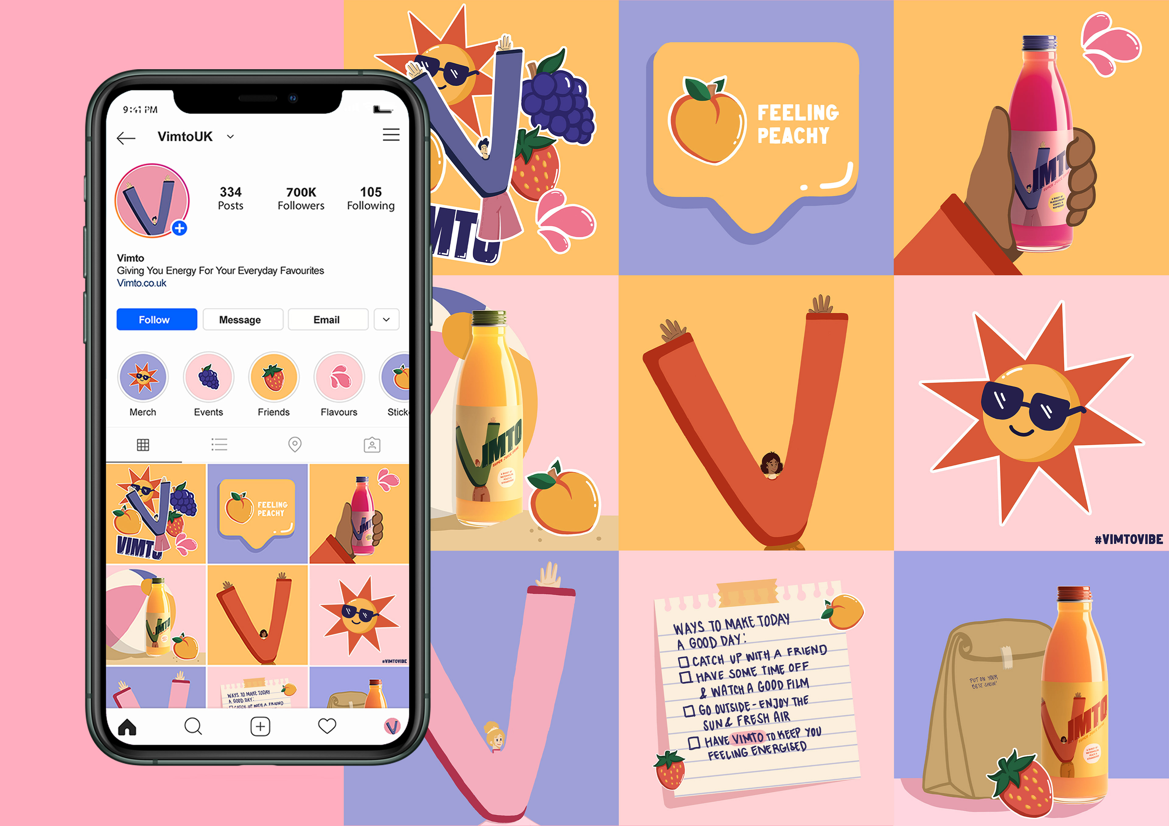
This rebrand emphasises the lively and fun nature of Vimto, without losing the brand's iconic letter 'V'. The use of characters in the identity playfully conveys the energy and life given to the customer as they continue to put on their best show every day of the week.
CATEGORY
Packaging
Brand Identity
SOFTWARE USED
Illustrator
Photoshop
Indesign
After Effects
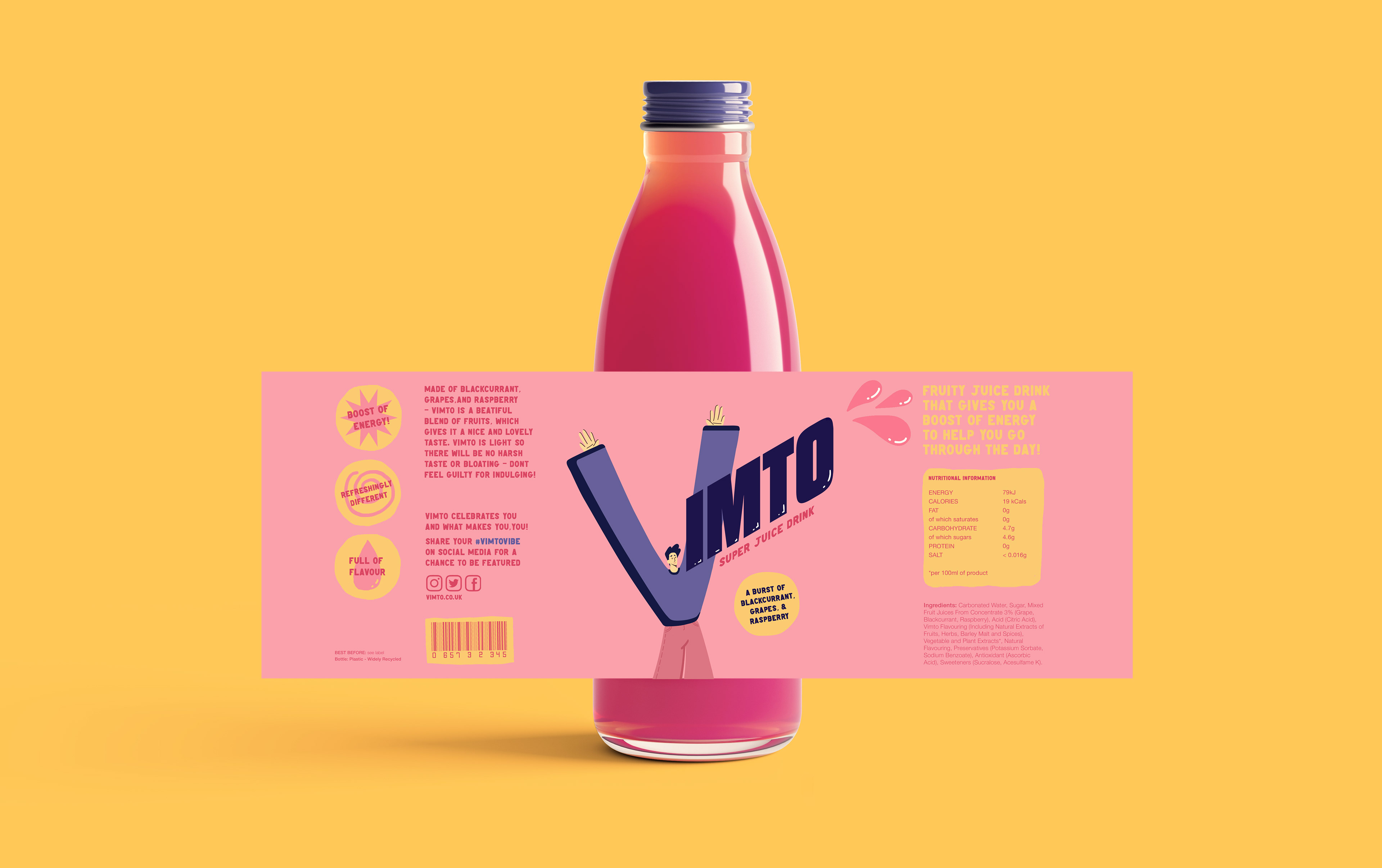
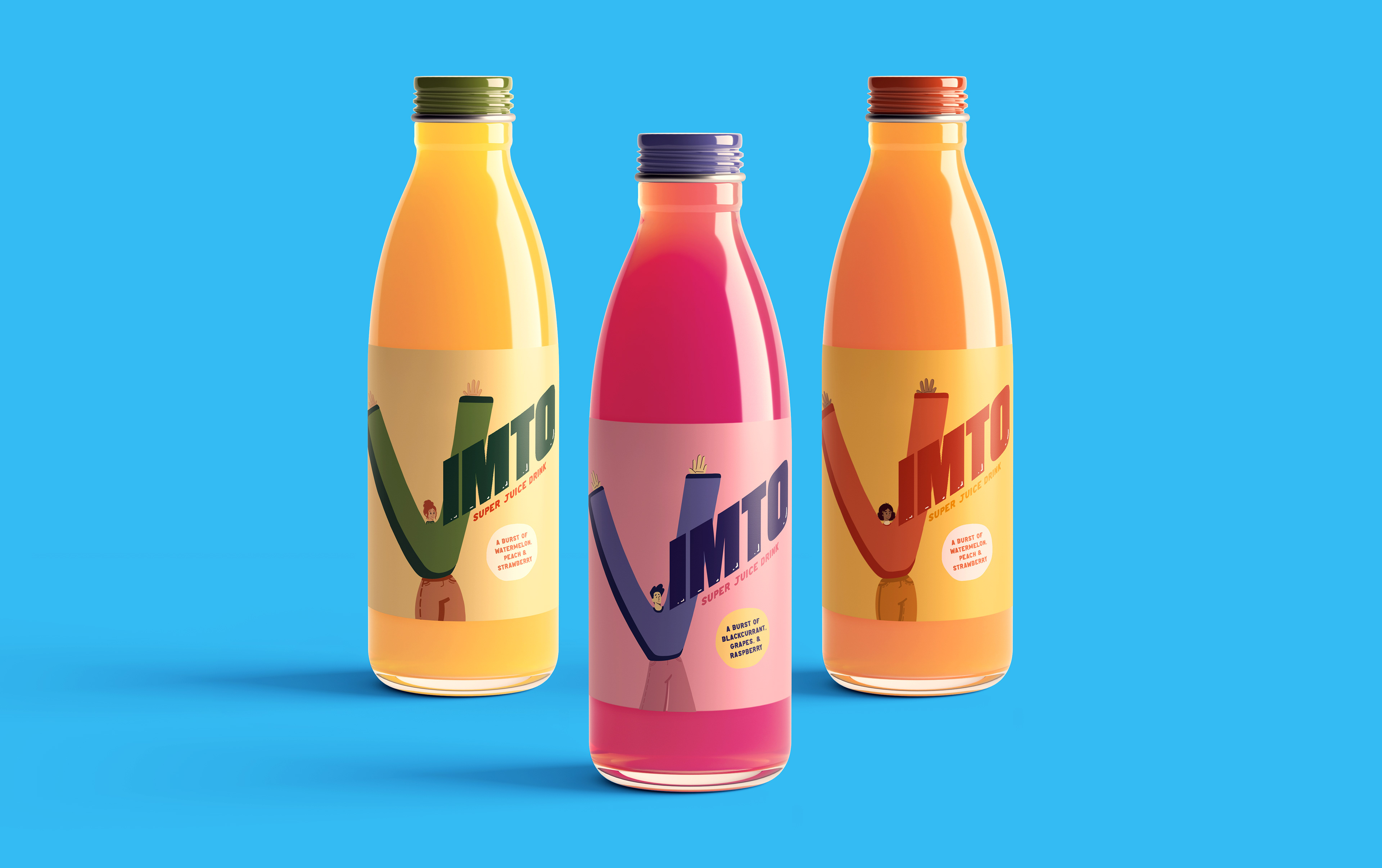

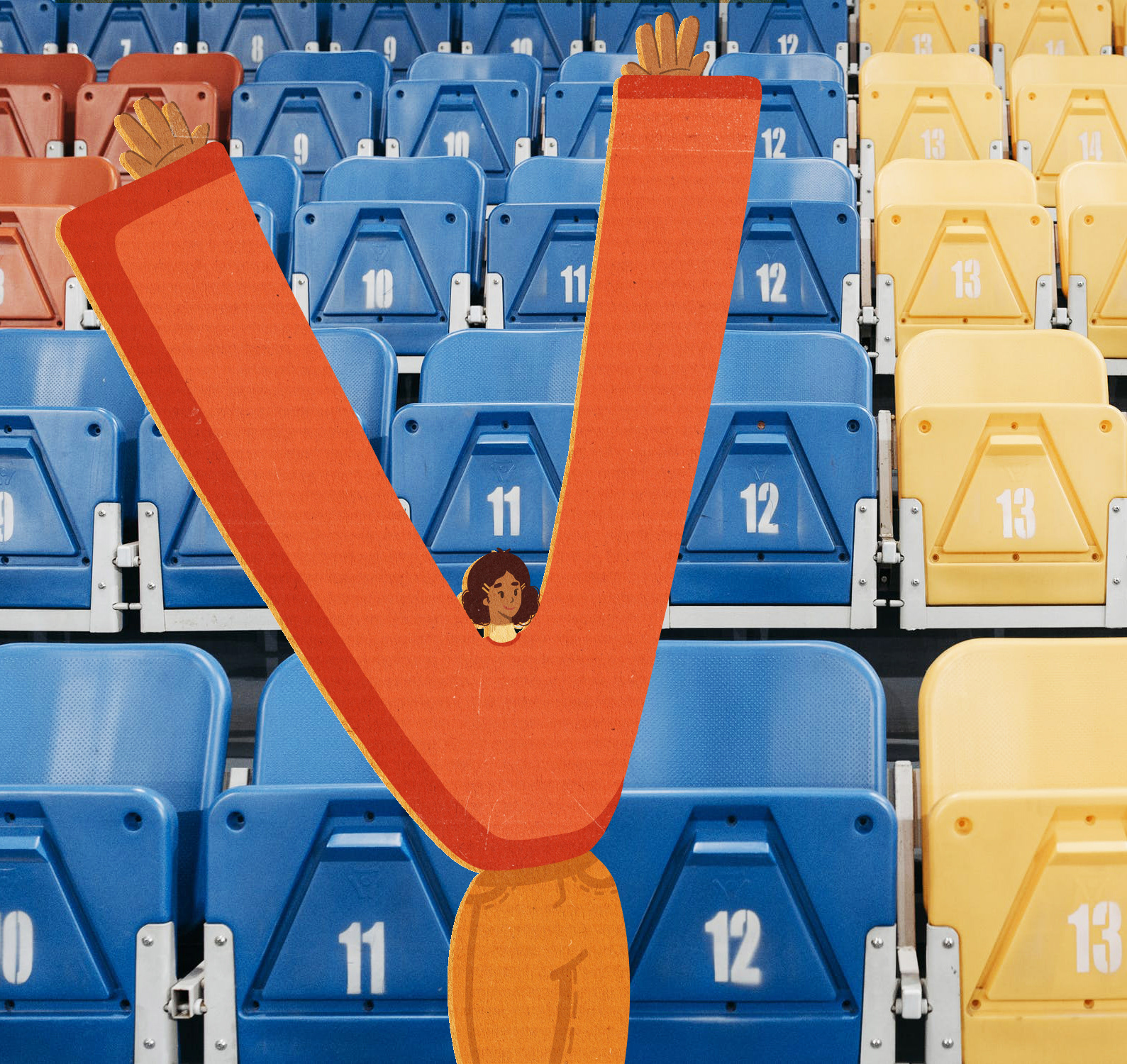
What makes the characters special is that not only do they represent the 'V' of Vimto, but they also show a sense of celebration - with their hands up in the air and a smile on their face.
The different characters emphasise the vibrancy of the brand, at the same time as showing a sense of community.
Vimto isn't just for athletes, dancers, or sportspeople - it's for everyone.
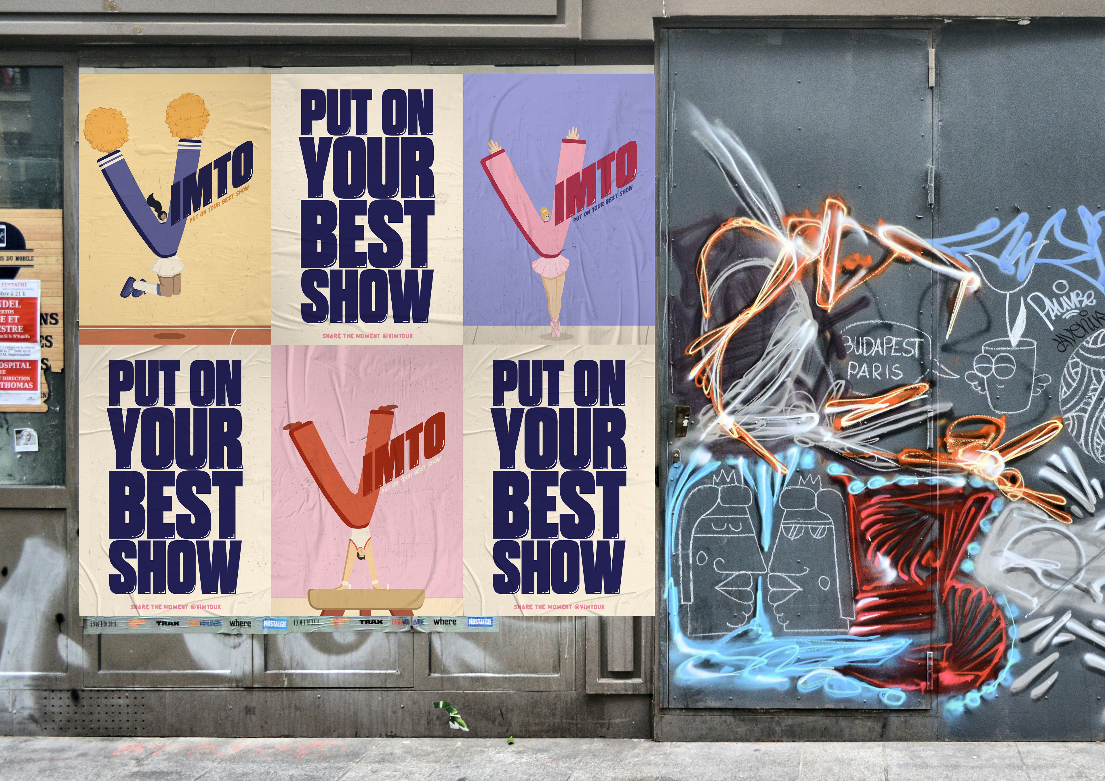
Inspired by the empty stadiums during the pandemic, the characters' energy doesn't stop at just posters and bottles. Cardboard cut outs can be placed in the audience's seats, cheering on the players and spreading the word of Vimto.
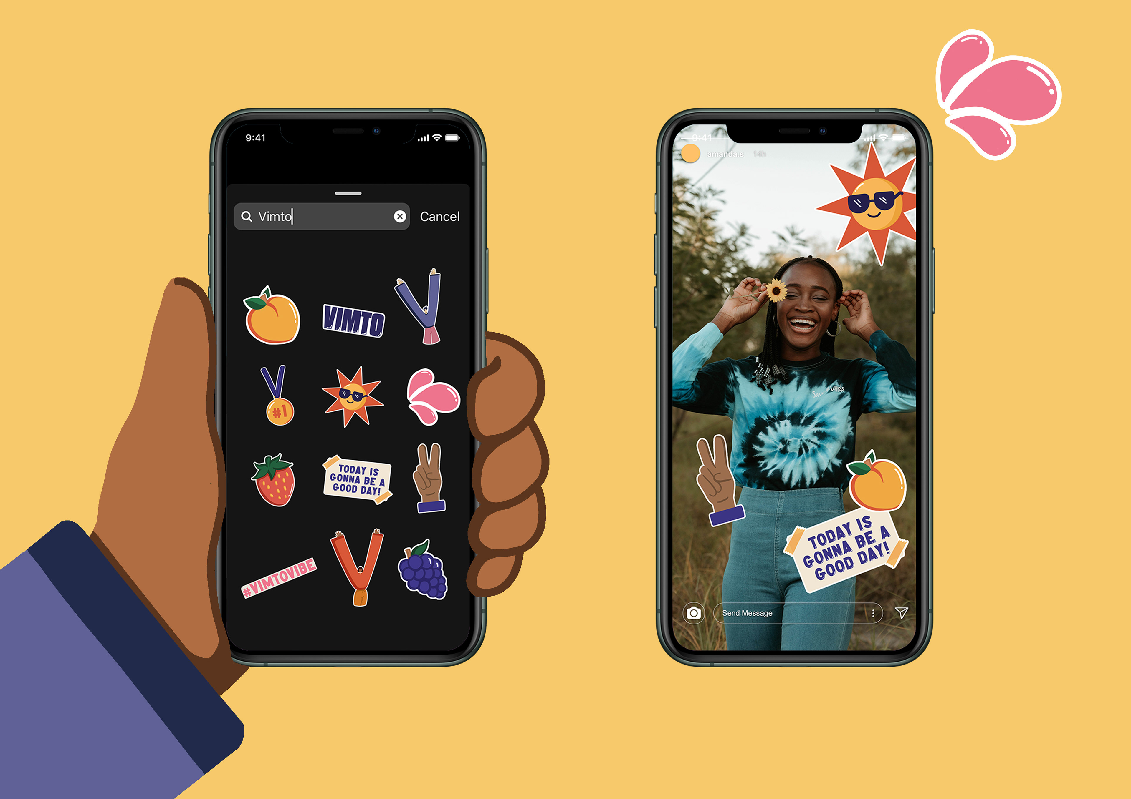
Of course, this would still work with live audiences too, and may even encourage them to take photos with the characters and share them on social media.